主界面布局
产品主界面通常包含顶部导航、页脚、侧边栏导航、主要内容区域等。
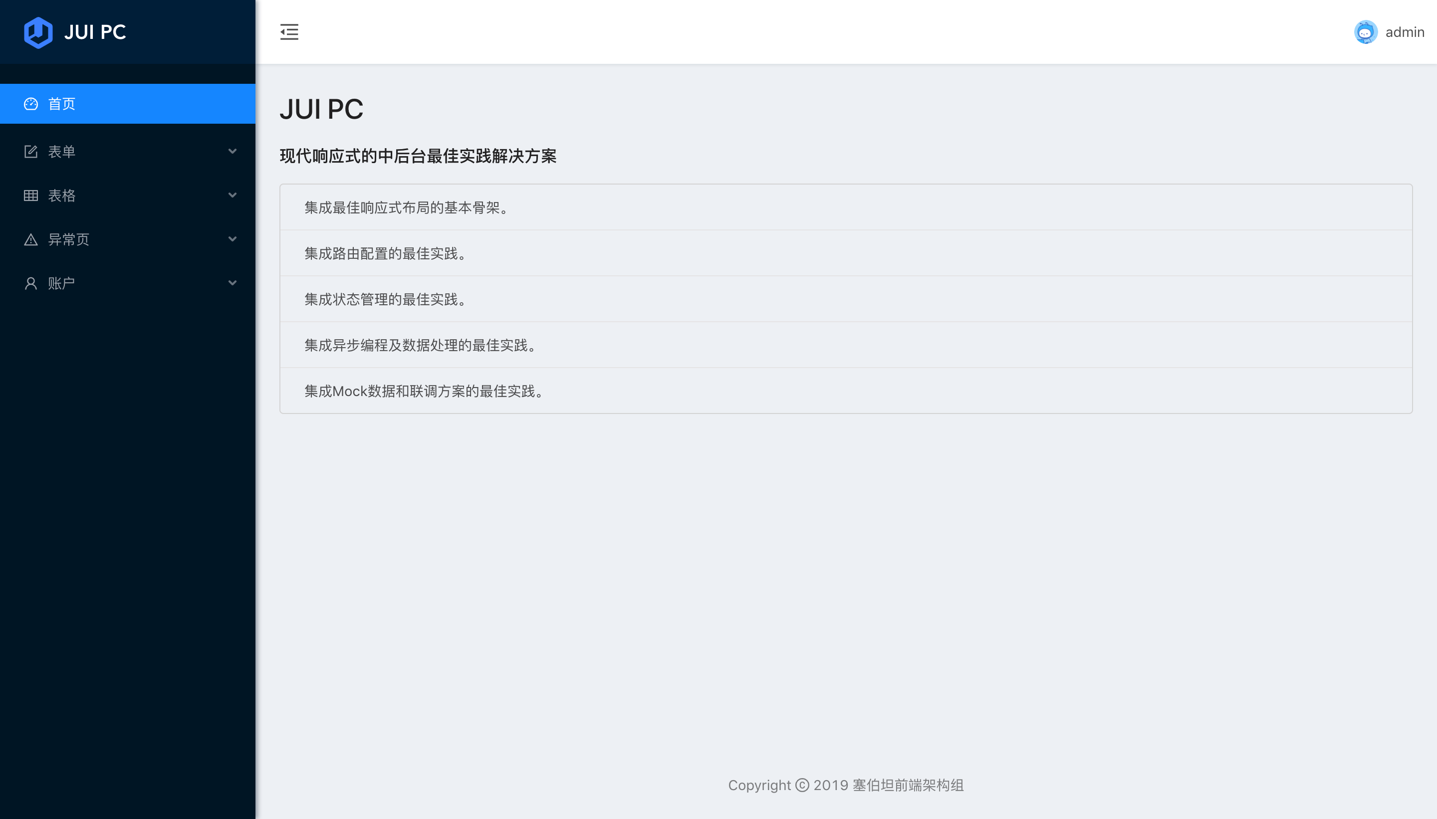
JUI使用一切皆为组件的架构原则,将产品主界面当作一个大的功能组件,并将与之相关的所有资源存放在layout/main目录中。
主界面目录结构
layout/main
├── components
│   ├── footer #页脚
│   │   ├── global-footer
│   │   │   ├── index.js
│   │   │   └── index.less
│   │   └── index.js
│   ├── header #顶部导航
│   │   ├── global-header
│   │   │   ├── index.js
│   │   │   ├── index.less
│   │   │   └── right-content.js
│   │   ├── index.js
│   │   ├── index.less
│   │   └── top-nav-header
│   │       ├── index.js
│   │       └── index.less
│   ├── page-wrapper #栅格布局
│   │   ├── index.js
│   │   └── index.less
│   └── sider-menu #侧边栏
│       ├── base-menu.js
│       ├── index.js
│       ├── index.less
│       ├── sider-menu-utils.js
│       └── sider-menu.js
├── config.js #主界面布局配置文件
├── index.js #主界面布局入口脚本
├── index.less #主界面布局样式
├── menu.js #导航菜单数据
├── pages #内容区域内的组件(页面)
│   ├── basic-form
│   │   ├── index.js
│   ├── basic-table
│   │   └── index.js
│   ├── dashboard
│   │   └── index.js
│   ├── search-table
│   │   └── index.js
│   └── step-form
│       └── index.js
└── routes.js #主界面路由配置
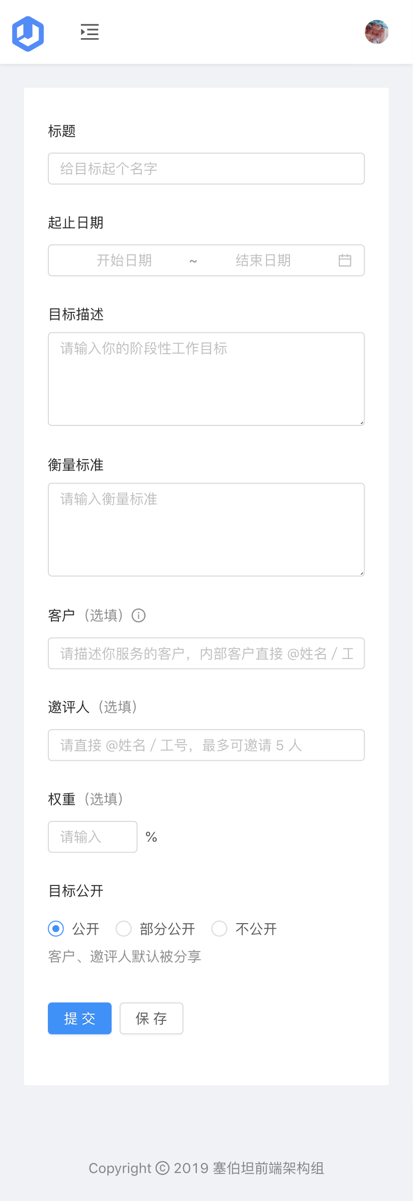
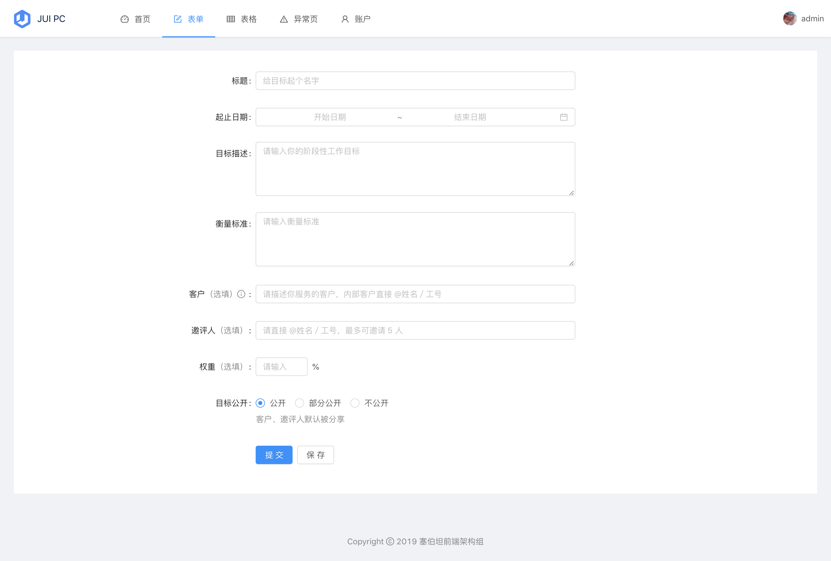
最佳响应式布局
JUI支持配置上下、左右两种基本布局,自适配PC端、移动端、Pad端、及不同大小屏幕。
上下布局
左右布局
响应式移动端
响应式Pad端
默认支持深、浅两种主题
左右结构的浅色主题
上下结构的浅色主题
主界面布局配置
JUI的产品主界面支持上下、左右两种结构,主题支持深、浅两种模式,内容区域支持定宽、自适应宽度,支持固定顶部导航、侧边栏导航等配置。
// views/index/layout/main/config.js
export default {
  navTheme: 'light', // 菜单的主题 content: dark or light
  layout: 'topmenu', // 菜单的布局,值为 sidemenu 菜单显示在左侧,值为 topmenu 菜单显示在顶部
  contentWidth: 'Fluid', // 内容的布局 Fixed 为定宽到1200px ,Fluid 为流式布局
  fixedHeader: false, // 固定页头
  autoHideHeader: false, // 下滑时自动隐藏页头
  fixSiderbar: false, // 固定菜单
  sysName: 'JUI' //系统名称
}
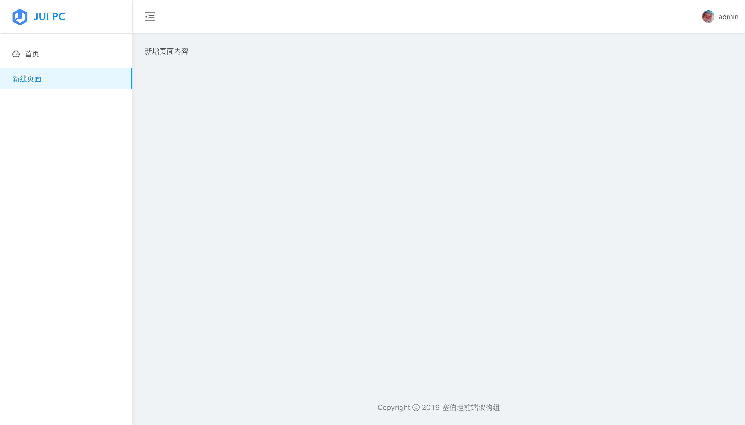
新增主界面页面
这里的页面指配置了主界面的路由,与顶部导航、侧边栏导航菜单结合,能够通过链接直接访问的组件。
1、在layout/main/pages下新建js文件
layout/main
├── index.js
├── pages #页面存放目录
│   └── new-page.js #新建页面
└── routes.js #路由配置
页面内容遵循React组件规则:
// layout/main/pages/new-page.js
import React, { Component, Fragment } from 'react'

export default class newPage extends Component {
  render() {
    return (
      <Fragment>
        新增页面内容
      </Fragment>
    )
  }
}
2、将页面加入路由
// layout/main/routes.js

import Loadable from '@/components/loadable' //懒加载组件

const Dashboard = Loadable(() => import('./pages/dashboard')) //首页面板
const newPage = Loadable(() => import('./pages/new-page')) //新增页面

export default [
  { path: '/dashboard', component: Dashboard },
  { path: '/new-page', component: newPage }
]
3、将页面导航加入菜单
// layout/main/menu.js

const menuData = [
  {
    name: '首页',
    icon: 'dashboard',
    path: 'dashboard'
  },
  {
    name: '新建页面',
    path: 'new-page'
  }
]
访问http://localhost:8080/index.html#/new-page就能看到页面内容了。
自定义区域内容
JUI使用了业内中后台产品界面布局的最佳实践,完成了大部分的布局逻辑,大多数业务场景只有修改产品主界面布局的右上角顶部导航区域、或者内容的页脚区域。
顶部导航
业务场景可能需要修改或扩展主界面右上角的内容,JUI已将右上角内容独立成组件,可在layout/main/components/header/gloabl-header/right-content.js文件中扩展或修改内容。
import React, { PureComponent } from 'react'
import { Spin, Dropdown, Menu, Icon, Avatar } from 'antd'
import styles from './index.less'

export default class GlobalHeaderRight extends PureComponent {
  render() {
    const {
      currentUser,
      onMenuClick,
      theme,
    } = this.props

    const menu = (
      <Menu className={styles.menu} selectedKeys={[]} onClick={onMenuClick}>
        <Menu.Item key="logout">
          <Icon type="logout" />退出登录
        </Menu.Item>
      </Menu>
    )

    let className = styles.right

    if (theme === 'dark') {
      className = `${styles.right}  ${styles.dark}`
    }

    return (
      <div className={className}>
        {currentUser.name ? (
          <Dropdown overlay={menu}>
            <span className={`${styles.action} ${styles.account}`}>
              <Avatar size="small" className={styles.avatar} src={currentUser.avatar} />
              <span className={styles.name}>{currentUser.name}</span>
            </span>
          </Dropdown>
        ) : (
            <Spin size="small" style={{ marginLeft: 8 }} />
          )}
      </div>
    )
  }
}
页脚
可在layout/main/components/footer/index.js文件中扩展或修改页脚内容。
import React, { Fragment } from 'react';
import { Layout, Icon } from 'antd';
import GlobalFooter from './global-footer';

const { Footer } = Layout;
const FooterView = () => (
  <Footer style={{ padding: 0 }}>
    <GlobalFooter
      links={[
        // {
        //   key: '塞伯坦CYB-CLI',
        //   title: '塞伯坦CYB-CLI',
        //   href: 'https://github.com/jd-cyb/cyb-cli',
        //   blankTarget: true,
        // },
        // {
        //   key: 'github',
        //   title: <Icon type="github" />,
        //   href: 'https://github.com/jd-cyb',
        //   blankTarget: true,
        // }
      ]}
      copyright={
        <Fragment>
          Copyright <Icon type="copyright" /> 2019 塞伯坦前端架构组
        </Fragment>
      }
    />
  </Footer>
);
export default FooterView;
响应式布局组件
JUI已在产品主界面的内容区域集成栅格布局,栅格布局是网页中最常用的布局,其特点就是按照一定比例划分页面,能够随着屏幕的变化依旧保持比例,从而具有弹性布局的特点。结合AntDesign的栅格组件提供的功能更为强大,能够设置间距、具有支持响应式的比例设置,以及支持 flex 模式,基本上涵盖了大部分的布局场景。
// layout/main/components/page-wrapper/index.js

import React, { PureComponent } from 'react';
import styles from './index.less';

export default class GridContent extends PureComponent {
  render() {
    const { contentWidth, children } = this.props;
    let className = `${styles.main}`;
    if (contentWidth === 'Fixed') {
      className = `${styles.main} ${styles.wide}`;
    }
    return <div className={className}>{children}</div>;
  }
}